Wordmark Logos 101: Definition, Examples, & Tips
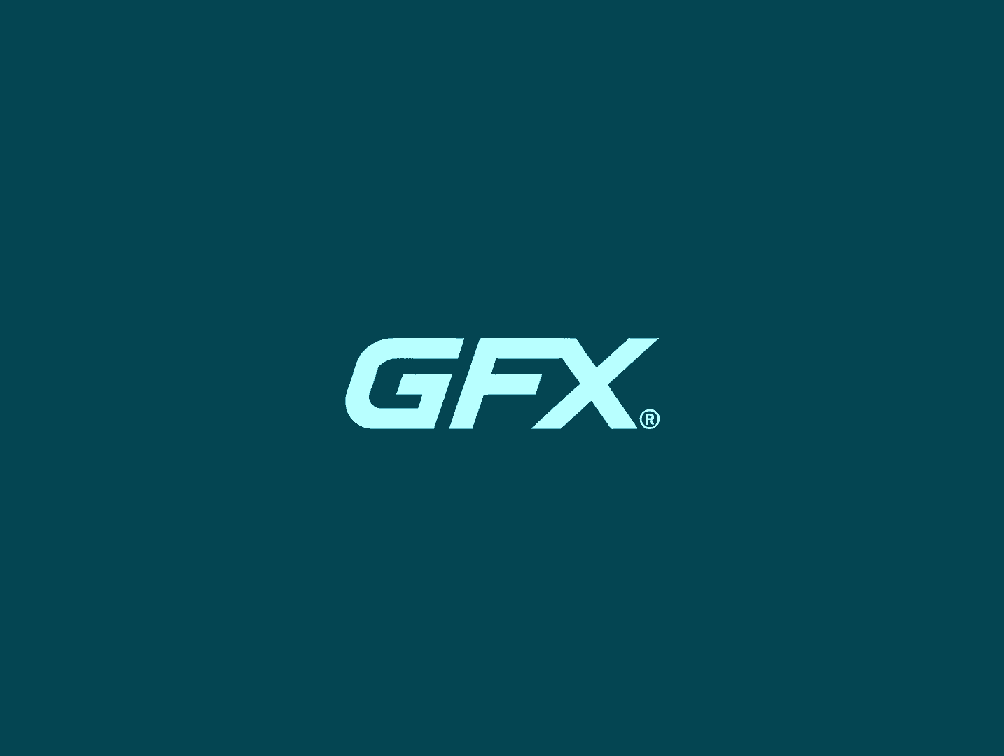
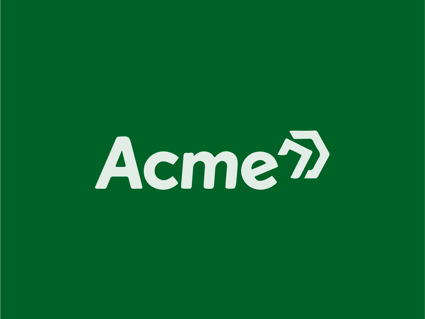
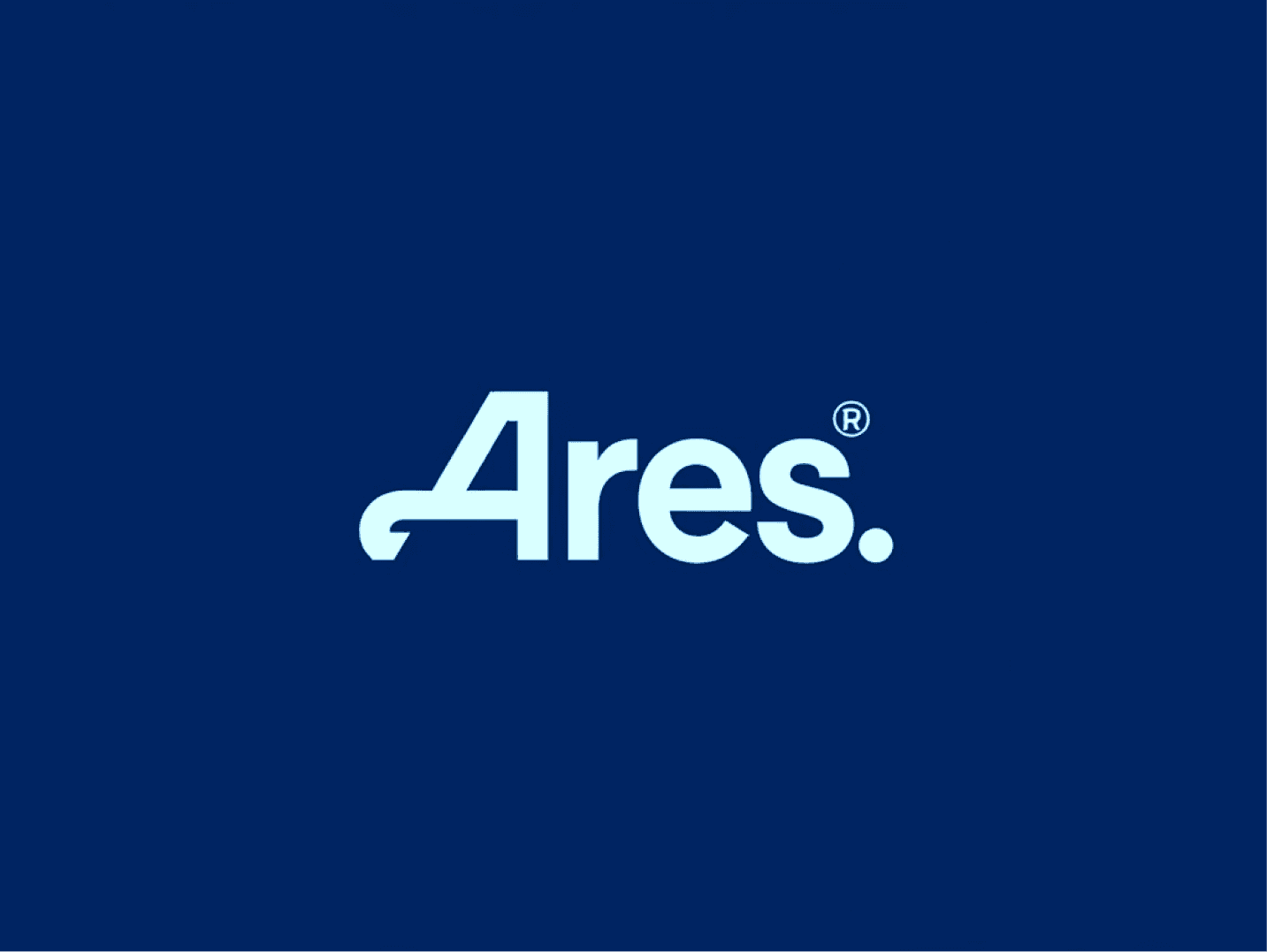
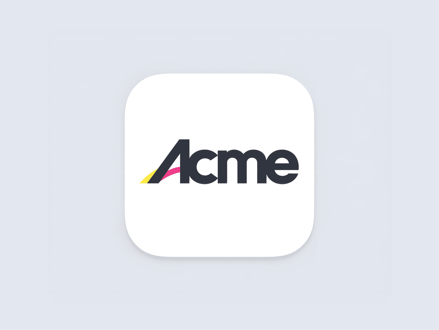
Wordmark logos rely solely on the name of the brand, using custom typography to create a distinct and recognizable design. It's great for building strong name recognition and works well for companies with unique or catchy names.
Easy to customize, made just for you
Professional Design & Beautiful Colors
Instantly Generated, 40x cheaper than alternatives
3,212+ happy customers have already used our AI Logo Generator

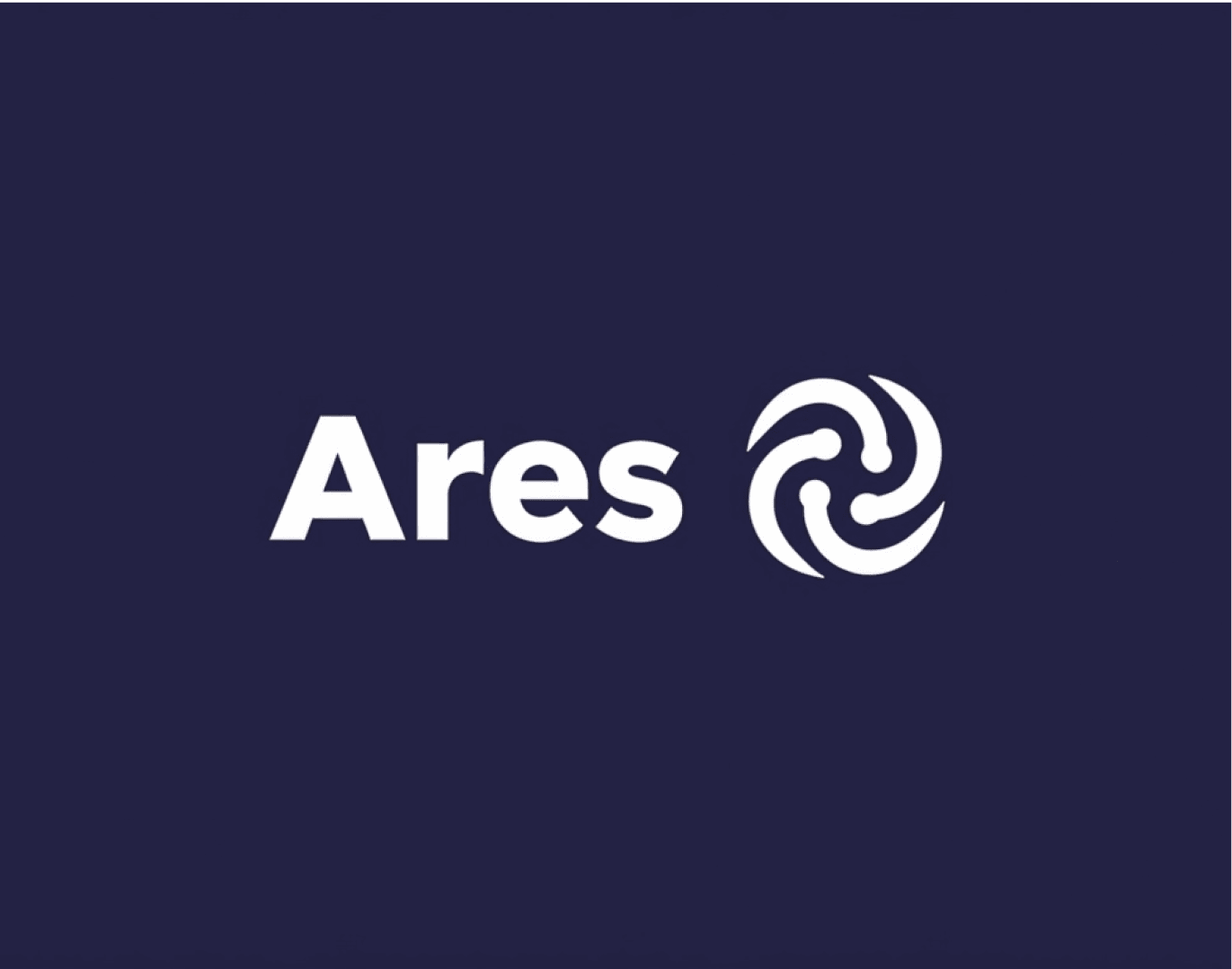
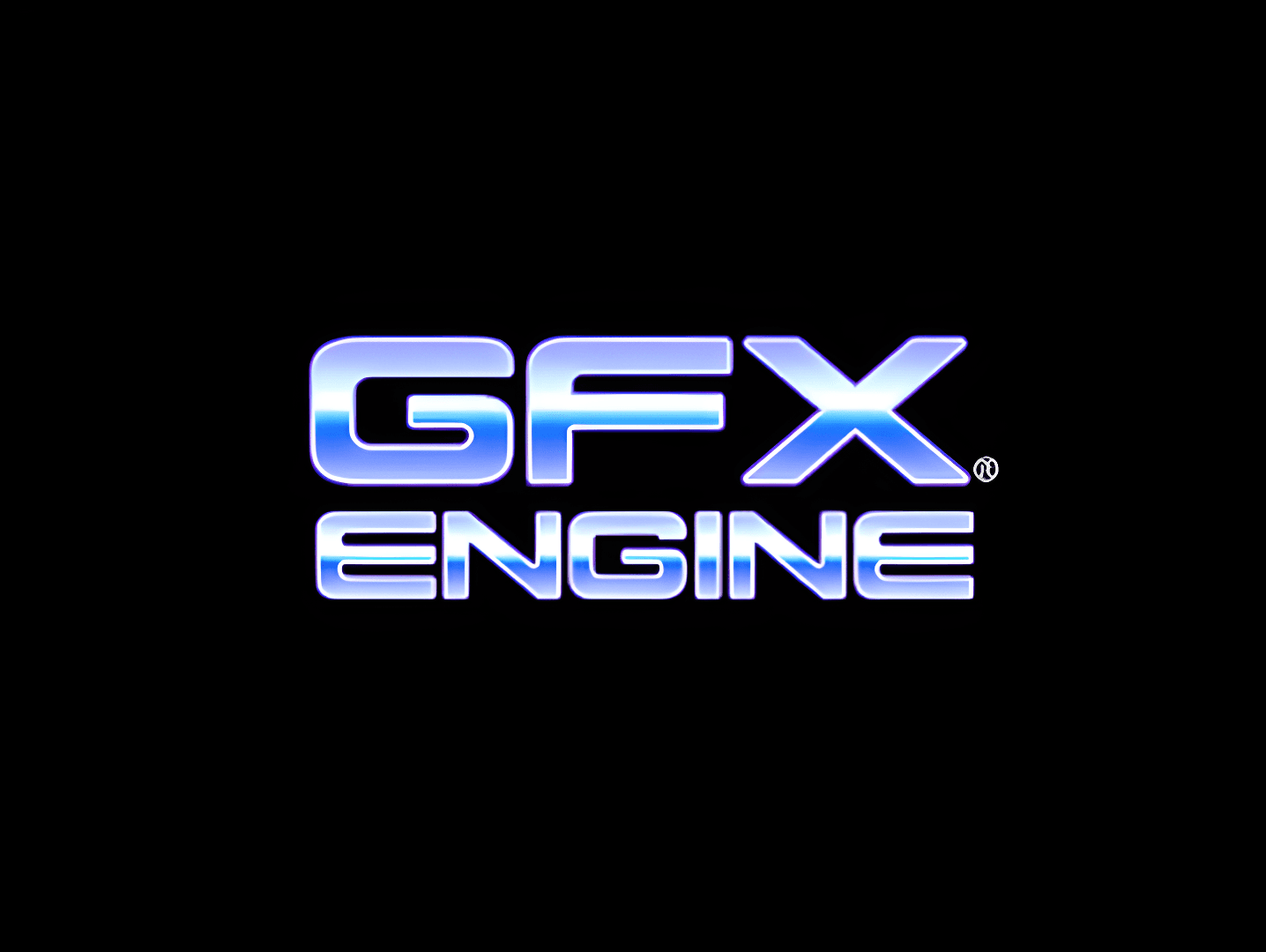
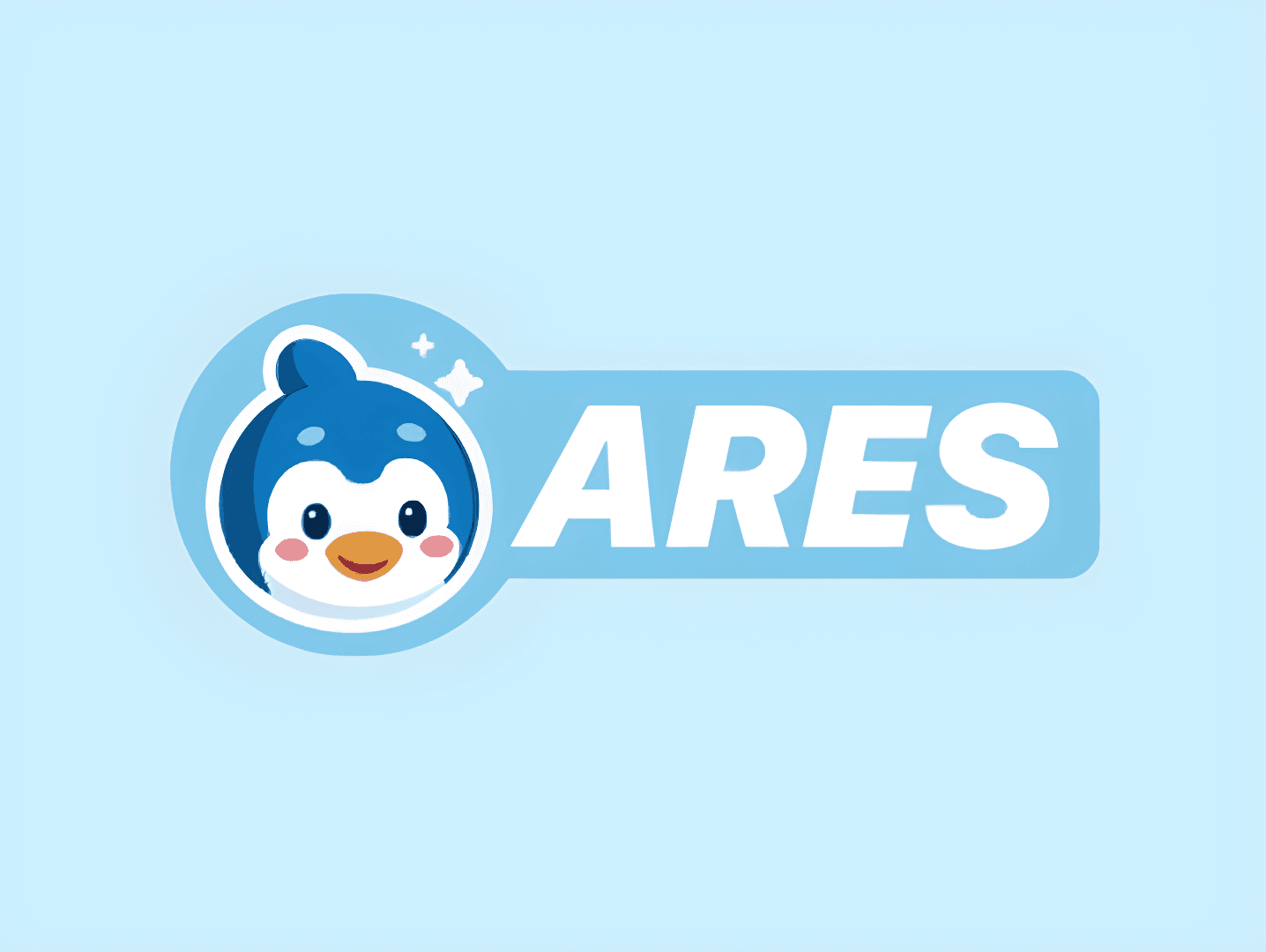
Some Wordmark Logos That We Love
Get started in minutes!
Focus on Typography
When it comes to wordmark logos, the font is everything. Choose a typeface that matches the vibe of the brand—whether it’s sleek and modern or playful and quirky.
Keep it clean and legible, but don’t be afraid to add a little flair. The right font can make a brand name stick in people’s minds, even if it’s just the name itself.
Play with Spacing and Alignment
It’s not just about the letters themselves; how they’re arranged matters just as much. Adjusting the spacing (kerning) between letters can change the whole feel of the logo.
Try experimenting with alignment too. Centered, left-aligned, or even stacking letters—small tweaks can give your wordmark a unique twist that makes it feel intentional.
Think About Where It’s Going
Wordmark logos are all about flexibility, so consider where it’ll be seen most. It should look good on a website header, a business card, or a social media profile.
If the brand name is long, see if you can create a version that’s compact too, without losing that distinct look. Adaptability makes a wordmark logo more practical for everyday use.
Get started in minutes!
Thousands of Logos Generated
For Thousands of Happy Customers
Ready to Generate a Logo?
This article was powered by LogoGen! Create a logo in any style you want for 40x less than a designer or agency. LogoGen is a logo generator that can generate logos instantly.

LogoGen supports many different style and color combinations!
Start Generating Logos
