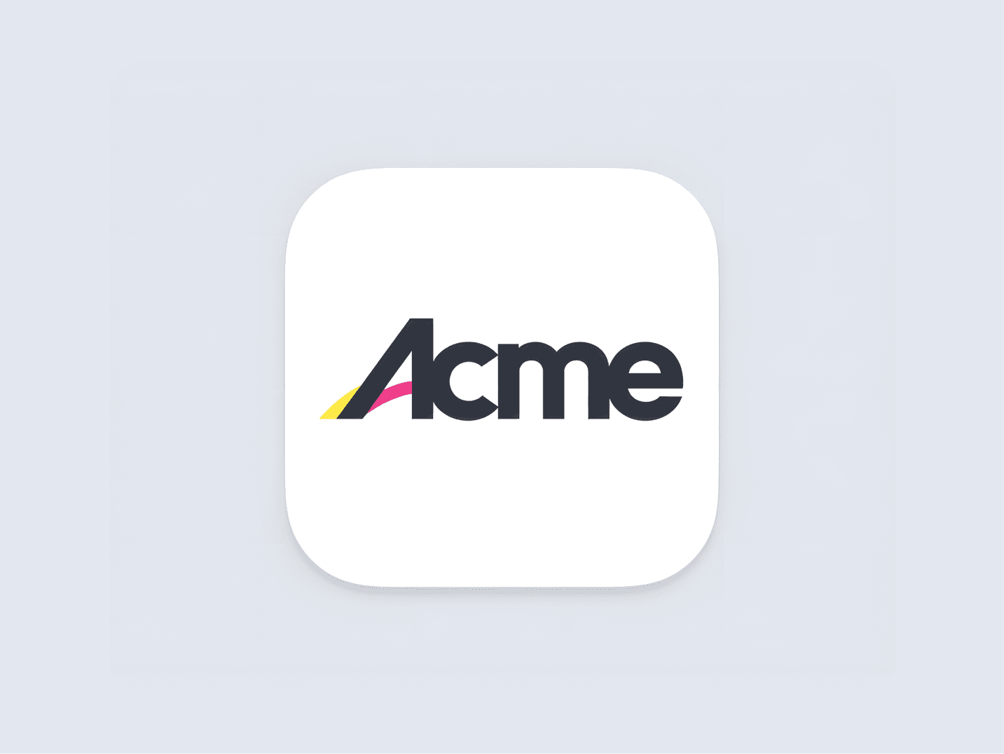
Minimalist Logos 101: Definition, Examples, & Tips
A minimalist logo focuses on reducing design elements to their essentials, using negative space, clean lines, and limited colors. It’s ideal for brands that want a refined, professional, and uncluttered look.
Easy to customize, made just for you
Professional Design & Beautiful Colors
Instantly Generated, 40x cheaper than alternatives
3,212+ happy customers have already used our AI Logo Generator

Some Minimalist Logos That We Love
Get started in minutes!
Embrace the Bare Essentials
Minimalistic logos shine when they strip things down to only what’s needed. Focus on the most essential elements—no extra lines, no distractions.
The beauty here is in clarity; every line, shape, or color should have a purpose that speaks to the brand’s vibe without saying too much.
Go for Simple Shapes and Clean Lines
Clean lines and simple shapes give minimalistic logos that modern, polished feel. Squares, circles, and straight lines are your friends; they keep things visually neat and easy to recognize.
Think about it as creating a logo that’s almost like a symbol—it should be able to hold its own, no matter how tiny or big it’s displayed.
Make Space Your Best Friend
Negative space is powerful in minimalistic logos. Letting the design “breathe” by giving it space can add depth without adding anything visually heavy.
Don’t be afraid of white space—it makes the logo feel more open and professional, giving people a chance to remember it without being overwhelmed.
Get started in minutes!
Thousands of Logos Generated
For Thousands of Happy Customers
Ready to Generate a Logo?
This article was powered by LogoGen! Create a logo in any style you want for 40x less than a designer or agency. LogoGen is a logo generator that can generate logos instantly.
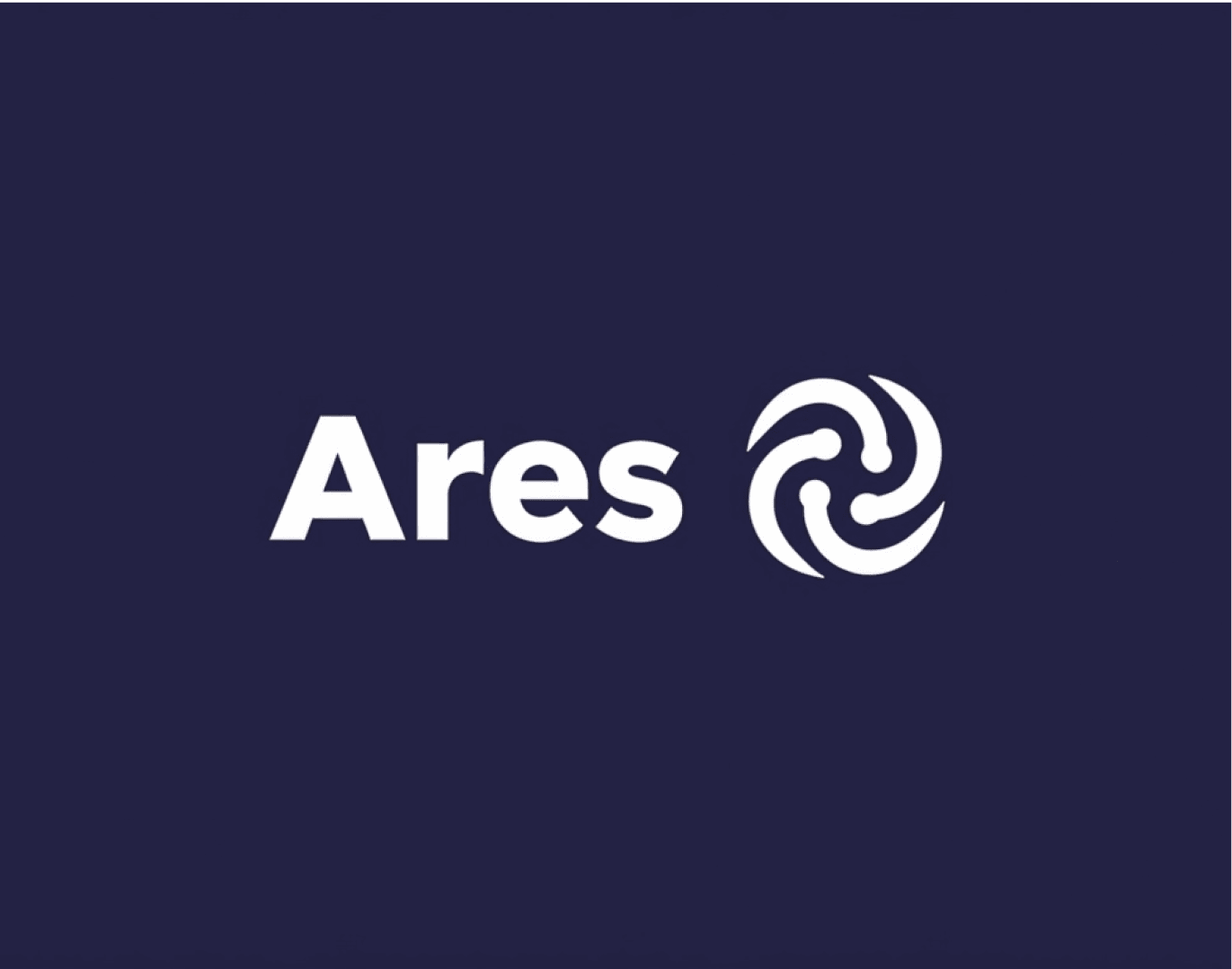

LogoGen supports many different style and color combinations!
Start Generating Logos